Prerequisites:
1. Reporting services extensions must be installed
2. Visual Studio tools must be installed
3. Dynamics AX should be connected to Reporting services instance
2. Visual Studio tools must be installed
3. Dynamics AX should be connected to Reporting services instance
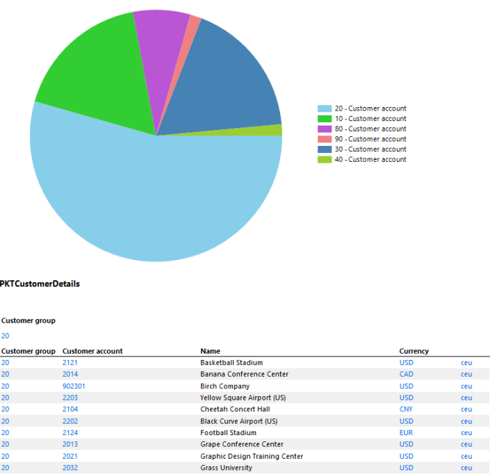
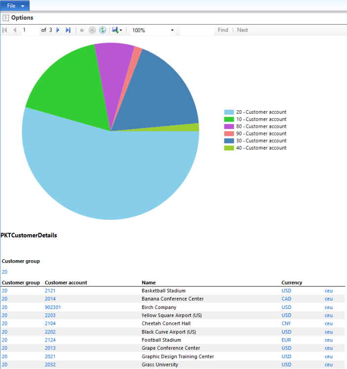
In this post we’ll learn how to create data visualization in SSRS report using Pie or Doughnut chart. We’ll be creating a query based AutoDesign report. This is how our report will look like at the end after following the mentioned development steps:
Steps:
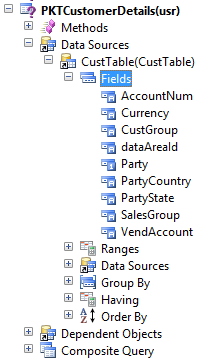
1. Create a new Query in the AOT. Name it as PKTCustomerDetails.
2. Add CustTable table to the Data sources node of query.
3. On the Fields node of CustTable, set the Dynamic property to Yes. This will add all the table fields to Fields node.
4. Set the Dynamic property to No and then remove unwanted fields to make the query light and report efficient. This way we can add fields quickly :)

5. We are done with the query now. Let’s design report in Visual Studio.
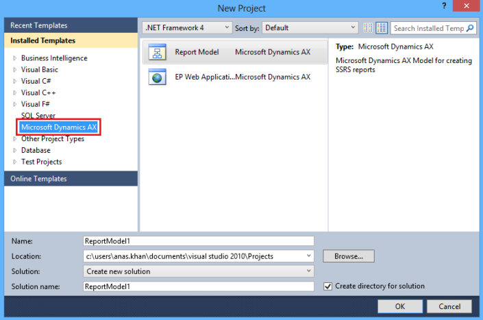
6. Open Visual Studio and create a new project using Microsoft Dynamics AX installed template. Name it as PKTCustomerDetails.
6. Open Visual Studio and create a new project using Microsoft Dynamics AX installed template. Name it as PKTCustomerDetails.

7. Right click the project node in the Solution Explorer, click Add > Report. Rename the report to PKTCustomerDetails.
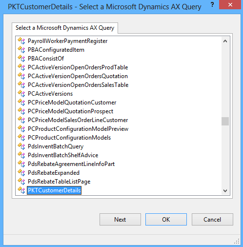
8. Add new Dataset to the report. Rename the dataset to PKTCustomerDetails.
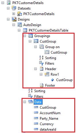
9. Set the Query property of the dataset to the newly created AOT QueryPKTCustomerDetails.
8. Add new Dataset to the report. Rename the dataset to PKTCustomerDetails.
9. Set the Query property of the dataset to the newly created AOT QueryPKTCustomerDetails.

10. Select all the fields of the query.
11. Drag the newly added dataset to the Designs node. This will automatically anAutoDesign to the report. Moreover a table will also be added for the dataset having all the fields in the Data node.
11. Drag the newly added dataset to the Designs node. This will automatically anAutoDesign to the report. Moreover a table will also be added for the dataset having all the fields in the Data node.

12. Drag the CustGroup field from dataset to the Groupings node of the table to group data by CustGroup field.
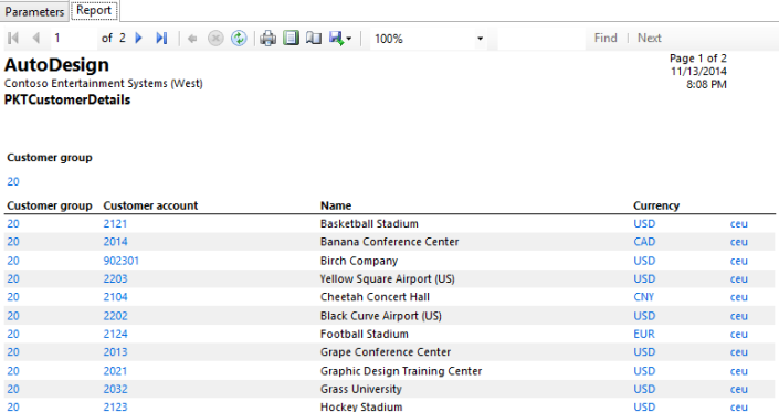
13. Preview the report. Your report should look like below:
13. Preview the report. Your report should look like below:

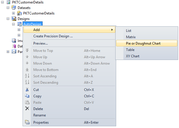
14. Now we’ll add Pie chart to our report to show total Customers per Customer Group.
15. Right click on the AutoDesign to add a Pie chart
15. Right click on the AutoDesign to add a Pie chart

16. Rearrange Pie chart so that it comes before table in the AutoDesign.
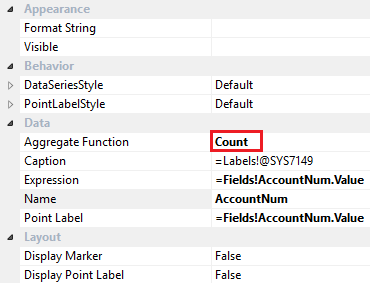
17. Drag AccountNum field from dataset to the Data node. Set its properties as shown below.
17. Drag AccountNum field from dataset to the Data node. Set its properties as shown below.

19. Drag CustGroup field to the Series node.
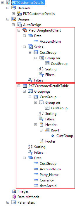
20. By now your report structure should look like as shown below.
20. By now your report structure should look like as shown below.

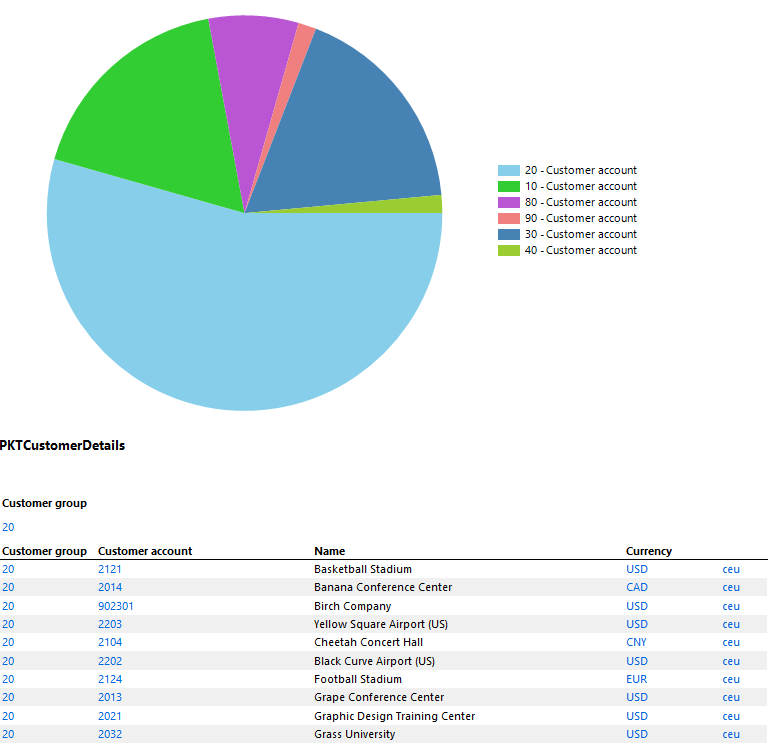
21. You may preview the report now to see multiple data regions in action – Pie chart and table.
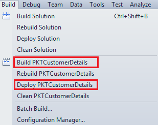
22. Now Build and Deploy the report from Visual Studio.
22. Now Build and Deploy the report from Visual Studio.

23. Go back to AX development workspace. PKTCustomerDetails report should be coming in AOT > SSRS Reports.
24. Create an Output menu item for the report PKTCustomerDetails.
25. We are good to view our report from within AX now by clicking the newly created output menu :)
24. Create an Output menu item for the report PKTCustomerDetails.
25. We are good to view our report from within AX now by clicking the newly created output menu :)

Mobile Van Advertising or Tata Ace Van Branding Service are used in promotional activities such as launching program, Inauguration of companies, advertisement of corporate companies.
ReplyDeleteTata ACE Advertising Chennai